Bar Chart Props

Basic props
| Prop |
Type |
Description |
Default value |
| data |
Array of items |
An item object represents a bar in the bar chart. It is described in the next table. |
_ |
| width |
number |
Width of the Bar chart |
width of the parent |
| height |
number |
Height of the Bar chart (excluding the bottom label) |
200 |
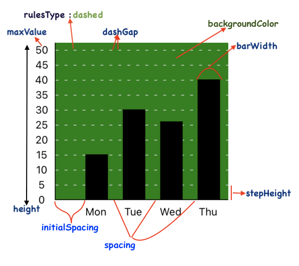
| maxValue |
number |
Maximum value shown in the Y axis |
200 |
| minValue |
number |
Minimum negative value shown in the Y axis (to be used only if the data set has negative values too) |
_ |
| noOfSections |
number |
Number of sections in the Y axis |
10 |
| noOfSectionsBelowXAxis |
number |
Number of sections in the Y axis below X axis (in case the data set has negative values too) |
0 |
| stepValue |
number |
Value of 1 step/section in the Y axis |
20 |
| stepHeight |
number |
Height of 1 step/section in the Y axis |
20 |
| spacing |
number |
Distance between 2 consecutive bars in the Bar chart |
20 |
| backgroundColor |
ColorValue |
Background color of the Bar chart |
_ |
| disableScroll |
Boolean |
To disable horizontal scroll |
false |
| showScrollIndicator |
Boolean |
To show horizontal scroll indicator |
false |
| showLine |
Boolean |
To show a Line chart over the Bar chart with the same data |
false |
| lineData |
Array of items |
The data object for the line chart (use only when showLine is true) |
data |
| lineConfig |
lineConfigType |
Properties of the Line chart shown over the Bar chart (lineConfigType) is described below |
defaultLineConfig |
| autoShiftLabels |
Boolean |
When set to true, automatically shifts the X axis labels for negative values |
false |
| scrollToEnd |
Boolean |
When set to true, the chart automatically scrolls to the rightmost bar |
false |
| scrollAnimation |
Boolean |
When set to true, scroll animation is visible when the chart automatically scrolls to the rightmost bar |
true |
| initialSpacing |
number |
distance of the first bar from the Y axis |
40 |
Alert!
These props are correlated:
- maxValue
- noOfSections
- stepValue
They must follow the relation:
maxValue = noOfSections * stepValue;
So, all the three must be used together. Using any 1 or 2 of them may produce absurd results
Combine Line Chart using showLine
You can add a line chart to your <BarChart/> component by passing the showLine prop.
The properties of this line chart can be controlled using the lineConfig prop which is an object. The lineConfig object is described below-
| Property |
Type |
Description |
Default value |
| initialSpacing |
number |
distance of the first data point from the Y axis |
initialSpacing for the Bar Chart |
| curved |
Boolean |
To show curved line joining the data points |
false |
| isAnimated |
Boolean |
To show animates Line Chart |
false |
| delay |
number |
Delay (in milliseconds) before starting the animation of the line |
0 |
| thickness |
number |
Thickness of the Line |
1 |
| color |
ColorValue |
Color of the Line |
'black' |
| hideDataPoints |
Boolean |
To hide data points along the Line chart |
false |
| dataPointsShape |
String |
Shape of the data points ('rectangular' or 'circular') |
'circular' |
| dataPointsWidth |
number |
Width of data points (when data points' shape is rectangular) |
2 |
| dataPointsHeight |
number |
Height of data points (when data points' shape is rectangular) |
2 |
| dataPointsColor |
ColorValue |
Color of the data points |
'black' |
| dataPointsRadius |
number |
Radius of data points (when data points' shape is circular) |
3 |
| textColor |
ColorValue |
Color of the dataPointText |
'gray' |
| textFontSize |
number |
Font size of the dataPointText |
10 |
| textShiftX |
number |
To shift the dataPointText text horizontally |
0 |
| textShiftY |
number |
To shift the dataPointText text vertically |
0 |
| shiftY |
number |
To shift the Lift the Line chart up or down by the given quantity |
0 |
| startIndex |
number |
Start index for data line (used to display data lines having breaks) |
0 |
| endIndex |
number |
End index for data line (used to display data lines having breaks) |
lineData.length -1 |
Item description
| Key |
Value type |
Description |
| value |
number |
Value of the item representing height of the bar |
| barWidth |
number |
Width of the bar |
| onPress |
function |
Function called on pressing the bar |
| disablePress |
Boolean |
Prop to disable the press action, defaults to false |
| frontColor |
ColorValue |
Color of the bar |
| sideColor |
ColorValue |
Color of the side view of the bar, only for 3 D |
| sideWidth |
number |
Width of the side view of the bar, only for 3 D |
| topColor |
ColorValue |
Color of the top view of the bar, only for 3 D |
| showGradient |
Boolean |
Prop to enable linear gradient for the bar color, defaults to false |
| gradientColor |
ColorValue |
Along with frontColor, this prop constitutes the 2 colors for gradient |
| label |
string |
Label text appearing below the bar (under the X axis) |
| labelWidth |
number |
Width of the Label text appearing below the bar (under the X axis) |
| labelTextStyle |
object |
Style object for the label text appearing below the bar |
| labelComponent |
Component |
Custom label component appearing below the bar |
| topLabelComponent |
Component |
Custom component appearing above the bar |
| topLabelContainerStyle |
object |
Style object for the container of the custom component appearing above the bar |
| cappedBars |
Boolean |
To show caps on the top of bar |
| capThickness |
number |
Thickness of the bar cap |
| capColor |
ColorValue |
Color of the bar cap |
| capRadius |
number |
Border radius of the bar cap |
| barBorderRadius |
number |
Border radius of the bar |
| spacing |
number |
Distance of the next Bar from the currennt Bar |
| barBackgroundPattern |
Component |
A svg component containing the background pattern for bars |
| patternId |
String |
ID of the pattern component |
Axes and rules related props
| Prop |
Type |
Description |
Default value |
| xAxisColor |
ColorValue |
X axis color |
black |
| xAxisThickness |
number |
X axis thickness |
1 |
| yAxisColor |
ColorValue |
Y axis color |
black |
| yAxisThickness |
number |
Y axis thickness |
1 |
| yAxisLabelWidth |
number |
Width of the Y axis Label container |
35 |
| yAxisTextStyle |
object |
Style object for the Y axis text style |
_ |
| yAxisLabelContainerStyle |
object |
Style object for the Y axis label container |
_ |
| horizontalRulesStyle |
object |
Style object for the horizontal rules container |
_ |
| showFractionalValues |
Boolean |
Allow fractional values for the Y axis label |
false |
| roundToDigits |
number |
Rounds the y axis values to given number of digits after decimal point |
1 |
| yAxisLabelPrefix |
String |
The String prepended to the y axis label text (for example- '$') |
'' |
| yAxisLabelSuffix |
String |
The String appended to the y axis label text |
'' |
| hideYAxisText |
Boolean |
To hide Y axis label text |
false |
| yAxisSide |
String |
Tells which side of the chart, should the y axis be present, defaults to 'left' |
'left' |
| rulesColor |
ColorValue |
Color of the horizontal rules |
lightgray |
| rulesThickness |
number |
Thickness of the horizontal rules |
1 |
| hideRules |
Boolean |
To hide the horizontal rules |
false |
| rulesType |
String |
solid or dotted/dashed |
solid |
| dashWidth |
number |
width of each dash |
4 |
| dashGap |
number |
gap between 2 dashes |
8 |
| showReferenceLine1 |
Boolean |
show reference line |
false |
| referenceLine1Config |
referenceConfigType |
properties of reference line like thickness, color etc (described below the table) |
_ |
| referenceLine1Position |
number |
position of reference line |
containerHeight / 2 |
| showReferenceLine2 |
Boolean |
show second reference line |
false |
| referenceLine2Config |
referenceConfigType |
properties of reference line like thickness, color etc (described below the table) |
_ |
| referenceLine2Position |
number |
position of second reference line |
3*containerHeight / 2 |
| showReferenceLine3 |
Boolean |
show third reference line |
false |
| referenceLine3Config |
referenceConfigType |
properties of reference line like thickness, color etc (described below the table) |
_ |
| referenceLine3Position |
number |
position of third reference line |
containerHeight / 3 |
| showVerticalLines |
Boolean |
To show vertical lines |
false |
| verticalLinesColor |
ColorValue |
Color of the vertical lines |
lightgray |
| verticallinesThickness |
number |
Thickness of the vertical lines |
1 |
| verticalLinesZIndex |
number |
Z index of the vertical lines |
-1 |
| showXAxisIndices |
Boolean |
To show the pointers on the X axis |
false |
| xAxisIndicesHeight |
number |
Height of the pointers on the X axis |
2 |
| xAxisIndicesWidth |
number |
Width of the pointers on the X axis |
4 |
| xAxisIndicesColor |
ColorValue |
Color of the pointers on the X axis |
black |
| showYAxisIndices |
Boolean |
To show the pointers on the Y axis |
false |
| yAxisIndicesHeight |
number |
Height of the pointers on the Y axis |
2 |
| yAxisIndicesWidth |
number |
Width of the pointers on the Y axis |
4 |
| yAxisIndicesColor |
ColorValue |
Color of the pointers on the X axis |
black |
| yAxisIndicesColor |
Boolean |
To hide axes, rules, labels altogether |
false |
| yAxisLabelTexts |
Array |
Array of label texts to be displayed along y axis |
null |
| rotateLabel |
Boolean |
To rotate the X axis labels (by 60deg) |
false |
| hideOrigin |
Boolean |
To hide the y Axis label at origin (i.e. 0) |
false |
| labelWidth |
number |
Width of the Label text appearing below the bar (under the X axis) |
barWidth |
| labelsExtraHeight |
number |
used to display large labels on X-axis (often rotated to show vertically) |
0 |
Note If you are setting yAxisSide to 'right', make sure to specify the width of the chart, using the width prop
ReferenceConfigType has following properties-
type referenceConfigType = {
  thickness: number,
  width: number,
  color: ColorValue | String | any,
  type: String,
  dashWidth: number,
  dashGap: number,
};
Bar related props
| Prop |
Type |
Description |
Default value |
| barWidth |
number |
Width of the bar |
30 |
| isThreeD |
Boolean |
Prop to render 3 dimensional bars |
false |
| frontColor |
ColorValue |
Color of the bar |
black for 2D, red for 3D |
| sideColor |
ColorValue |
Color of the side view of the bar, only for 3 D |
red |
| sideWidth |
number |
Width of the side view of the bar, only for 3 D |
red |
| topColor |
ColorValue |
Color of the top view of the bar, only for 3 D |
red |
| showGradient |
Boolean |
Prop to enable linear gradient for the bar color |
false |
| gradientColor |
ColorValue |
Along with frontColor, gradientColor constitutes the 2 colors for gradient |
white |
| roundedTop |
Boolean |
To show rounded top |
white |
| roundedBottom |
Boolean |
To show rounded bottom |
white |
| activeOpacity |
number |
activeOpacity on pressing the bar |
0.2 |
| disablePress |
Boolean |
Prop to disable the bar press action |
false |
| barBorderRadius |
number |
Border radius of the bar |
0 |
| barBackgroundPattern |
Component |
A svg component containing the background pattern for bars |
_ |
| patternId |
String |
ID of the pattern component |
_ |
Animation related props
| Prop |
Type |
Description |
Default value |
| isAnimated |
Boolean |
To show animates BarChart. Animation occurs onLoad and on value change |
false |
| animationDuration |
number |
Duration of the animations |
800 |
| animationEasing |
Easing |
Easing applied to the animation |
Easing.ease |
Alert!
While rendering an Animated Bar chart, y axis labels may not appear sometimes. This can be fixed using a key prop as shown -
<BarChart key={'xyz'} data={data} isAnimated />
Bar related props for making Capped Bar chart
| Prop |
Type |
Description |
Default value |
| cappedBars |
Boolean |
To show caps on the top of bars |
false |
| capThickness |
number |
Thickness of the bar caps |
6 |
| capColor |
ColorValue |
Color of the bar caps |
gray |
| capRadius |
number |
Border radius of the bar caps |
0 |
Props for horizontal BarChart
| Prop |
Type |
Description |
Default value |
| horizontal |
Boolean |
Render horizontal BarChart |
false |
| yAxisAtTop |
Boolean |
In horizontal BarCharts the Y axis appears at bottom by default. Set it to true for otherwise |
false |
| intactTopLabel |
Boolean |
To rotate the top label component to make it intact with the Bars |
false |
Props for Stacked Bar Charts
To render stacked charts, you need to pass the prop stackData instead of data.
The structure of stackData is-
[
    {
      stacks:
        [
            {
                value: 10, color: 'red', onPres: someFunction
            },
            {
                value: 20, color: 'blue', marginBottom: 1, onPres: someFunction
            },
            ...
        ],
      label: 'Jan',
      ...otherProps,
    },
    {
      stacks:
        [
            {
                value: 8, color: 'red', onPres: someFunction
            },
            {
                value: 17, color: 'blue', marginBottom: 1, onPres: someFunction
            },
            ...
        ],
      label: 'Feb',
      ...otherProps,
    },
    ...
]
The stackData passed to the BarChart component is an array of objects.
Each object contains a mandatory key named stacks.
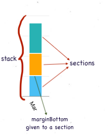
The value corresponding to the stacks key is an array of objects, each object representing a section of the stack.
| Prop |
Type |
Description |
Default value |
| stackData |
Array of stack arrays |
A stack array represents a stack of bars in the bar chart. It is described in the next table |
false |
Stack Array description
| Key |
Value type |
Description |
| stacks array |
Array of stack items |
A stack is made of 1 or more objects of the type described in the next table |
| label |
string |
Label text appearing below the stack (under the X axis) |
| labelTextStyle |
Style object for the label text appearing below the stack |
|
A single stack item can be depicted as-

Stack item description
| Key |
Value type |
Description |
| value |
number |
Value of the item representing height of the stack item |
| color |
ColorValue |
Color of the stack item |
| onPress |
function |
Function called on pressing the stack item |
| marginBottom |
number |
margin below a particular stack section |
| barBorderRadius |
number |
Border radius of a stack section |
| borderTopLeftRadius |
number |
borderTopLeftRadius for a stack section |
| borderTopRightRadius |
number |
borderTopRightRadius for a stack section |
| borderBottomLeftRadius |
number |
borderBottomLeftRadius for a stack section |
| borderBottomRightRadius |
number |
borderBottomRightRadius for a stack section |

