5.6 KiB
5.6 KiB
react-native-camera-kit
Native camera control.
Install
Install using npm or yarn:
npm install react-native-camera-kit --save
Or if you're using yarn:
yarn add react-native-camera-kit
iOS
- Locate the module lib folder in your node modules:
PROJECT_DIR/node_modules/react-native-camera-kit/lib - Drag the
ReactNativeCameraKit.xcodeprojproject file into your project - Add
libReactNativeCameraKit.ato all your target Linked Frameworks and Libraries (prone to be forgotten)
Android
Add the following to your project's settings.gradle file:
+ include ':rncamerakit'
+ project(':rncamerakit').projectDir = new File(rootProject.projectDir, '../node_modules/react-native-camera-kit/android/')
Then add to your app app/build.gradle in the dependencies section:
+ compile project(":rncamerakit")
Then in MainActivity.java add:
+ import com.wix.RNCameraKit.RNCameraKitPackage;
And in the package list in the same file (e.g. getPackages) add:
+ new RNCameraKitPackage()
How to use
CameraKitCamera inside the render function
<CameraKitCamera
  ref={cam => this.camera = cam}
  style={{
    flex: 1,
    backgroundColor: 'white'
  }}
  cameraOptions={{
    flashMode: 'auto',             // on/off/auto(default)
    focusMode: 'on',               // off/on(default)
    zoomMode: 'on',                // off/on(default)
    ratioOverlay:'1:1',            // optional, ratio overlay on the camera and crop the image seamlessly
    ratioOverlayColor: '#00000077' // optional
  }}
/>
CameraKitCamera cameraOptions
| Attribute | Values | Description |
|---|---|---|
| flashMode | 'on'/'off'/'auto' |
camera flash mode (default is auto) |
| focusMode | 'on'/'off' |
camera focus mode (default is on) |
| zoomMode | 'on'/'off' |
camera zoom mode |
| ratioOverlay | ['int':'int', ...] |
overlay on top of the camera view (crop the image to the selected size) Example: ['16:9', '1:1', '3:4'] |
| ratioOverlayColor | Color | any color with alpha (default is '#ffffff77') |
CameraKitCamera API
checkDeviceCameraAuthorizationStatus
const isCameraAuthorized = await CameraKitCamera.checkDeviceCameraAuthorizationStatus();
return values:
AVAuthorizationStatusAuthorized returns true
AVAuthorizationStatusNotDetermined returns -1
otherwise, returns false
requestDeviceCameraAuthorization
const isUserAuthorizedCamera = await CameraKitCamera.requestDeviceCameraAuthorization();
AVAuthorizationStatusAuthorized returns true
otherwise, returns false
capture
Capture image
const image = await this.camera.capture(true);
setFlashMode
Set flash mode (auto/on/off)
const success = await this.camera.setFlashMode(newFlashData.mode);
changeCamera
Change to fornt/rear camera
const success = await this.camera.changeCamera();
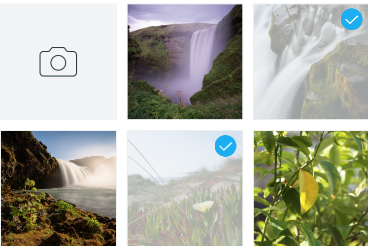
CameraKitGalleryView
Native Gallery View (based on UICollectionView)
<CameraKitGalleryView
  ref={gallery => this.gallery = gallery}
  style={{flex: 1, marginTop: 20}}
  minimumInteritemSpacing={10}
  minimumLineSpacing={10}
  albumName={<ALBUM_NAME>}
  columnCount={3}
  onTapImage={event => {
    // result.nativeEvent.selected - ALL selected images Photos Framework ids
  }}
  selectedImages={<MAINTAIN_SELECETED_IMAGES>}
  selectedImageIcon={require('<IMAGE_FILE_PATH>'))}
  unSelectedImageIcon={require('<IMAGE_FILE_PATH>')}
/>
| Attribute | Values | Description |
|---|---|---|
| minimumInteritemSpacing | Float | Minimum inner Item spacing |
| minimumLineSpacing | Float | Minimum line spacing |
| imageStrokeColor | Color | Image stroke color |
| albumName | String | Album name to show |
| columnCount | Integer | How many clumns in one row |
| onTapImage | Function | Callback when image tapped |
| selectedImages | Array | Selected images (will show the selected badge) |
| selectedImageIcon | require(_PATH_) |
- DEPRECATED use Selection - Selected image badge image |
| unSelectedImageIcon | require(_PATH_) |
- DEPRECATED use Selection - Unselected image badge image |
| selection | Object | See Selection section |
| getUrlOnTapImage | Boolean | iOS only - On image tap return the image internal (tmp folder) uri (intead of Photos.framework asset id) |
| customButtonStyle | Object | See Custom Button section |
| onCustomButtonPress | Function | Callback when custom button tapped |
| contentInset (iOS) | Object | The amount by which the gellery view content is inset from its edges (similar to ScrollView contentInset) |
Custom Button
| Attribute | Values | Description |
|---|---|---|
| image | require(_PATH_) |
Custom button image |
| backgroundColor | Color | Custom button background color |
Selection
| Attribute | Values | Description |
|---|---|---|
| selectedImage | require(_PATH_) |
Selected image badge image |
| unselectedImage | require(_PATH_) |
Unselected image badge image |
| imagePosition | bottom/top-right/left / center |
Selected/Unselected badge image position (Default:top-right) |
| overlayColor | Color | Image selected overlay color |
| imageSizeAndroid | large/medium |
Android Only - Selected badge image size |


