10 KiB
Using Forms
This feature allows you to create custom forms for collecting and managing data within your workflows. Whether you need a simple feedback form or a complex multi-step form, SpiffArena provides you with the tools to build and integrate forms seamlessly.
With SpiffArena's form builder, you can start with basic form elements and gradually add more advanced components as your form requirements evolve. Let's dive in and explore the possibilities of creating forms in SpiffArena.
Instructions on Creating Forms
Forms play a crucial role in capturing data, and SpiffArena offers a powerful form-building capability. Here are the ways to create forms:
- Leveraging JSON Schema
JSON Schema is an standard for describing the structure of data in a JSON file. JSON Schema forms the foundation for building forms in SpiffArena.
To simplify the form creation process, we leverage the React JSON Schema Form (RJSF) library. RJSF is a powerful tool that uses JSON Schema as its basis. It enables you to create dynamic and interactive forms with ease. The RJSF library is open source, free to use, and follows the principles of open standards.
Please note that while this guide provides a basic understanding of JSON Schema and RJSF, there is much more to explore. We encourage you to refer to the official RJSF documentation for comprehensive details and advanced techniques.
- Using Form Builder
An alternative approach to creating JSON code is to utilize the form builder feature, which allows you to easily create various fields without the need for writing JSON manually.
However, it's important to note that the form builder may have certain limitations in terms of features and may not be as powerful as using the JSON editor directly.
While the form builder provides convenience and simplicity, using the JSON editor offers greater flexibility and control over the form structure.
- Creating Forms from BPMN Editor
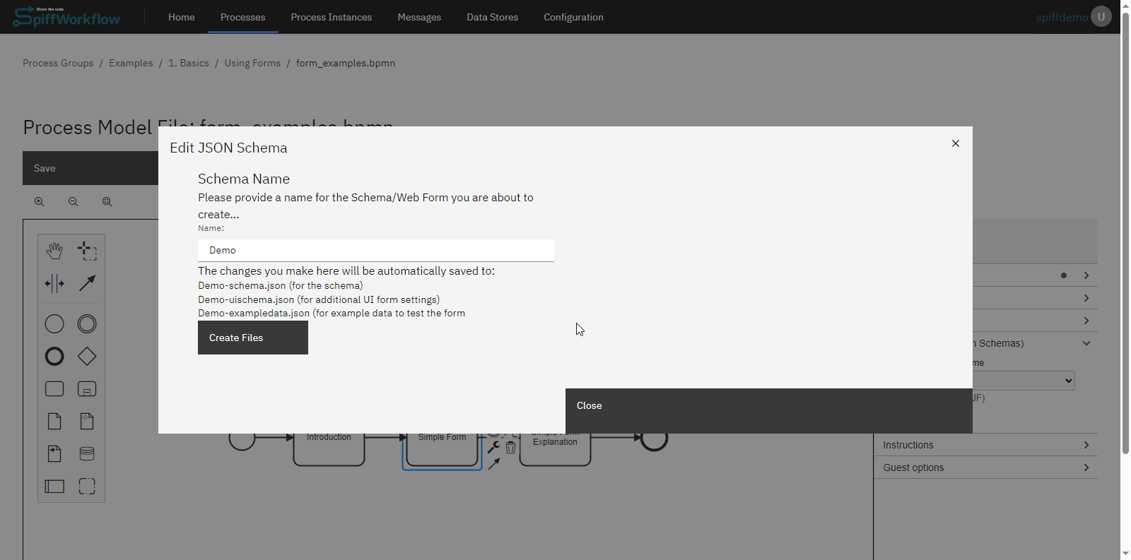
To create forms inside editor, we utilize user tasks within the BPMN file. Upon creating a new BPMN file, open it to access the editor.
Initiating the Form Editor
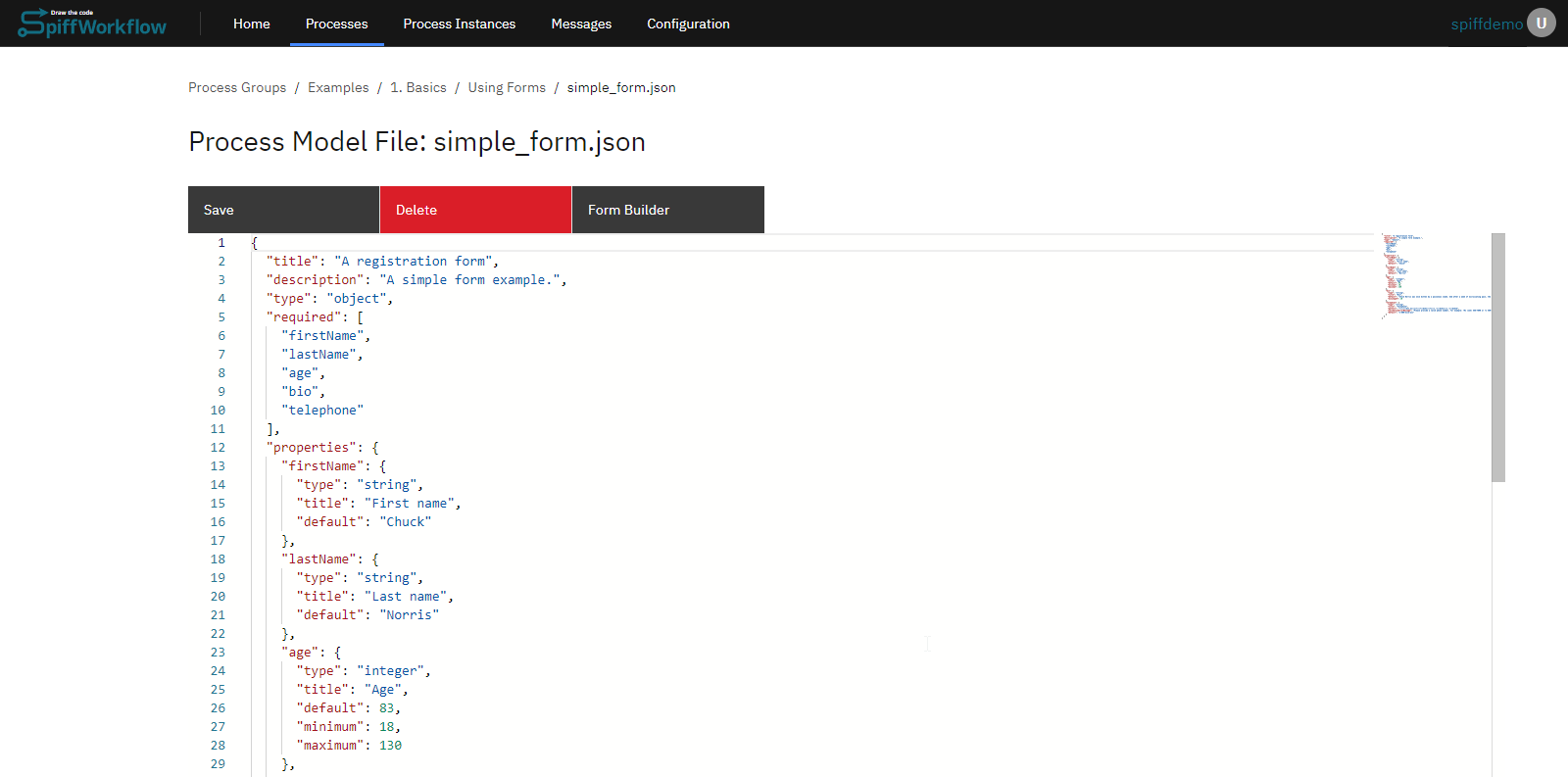
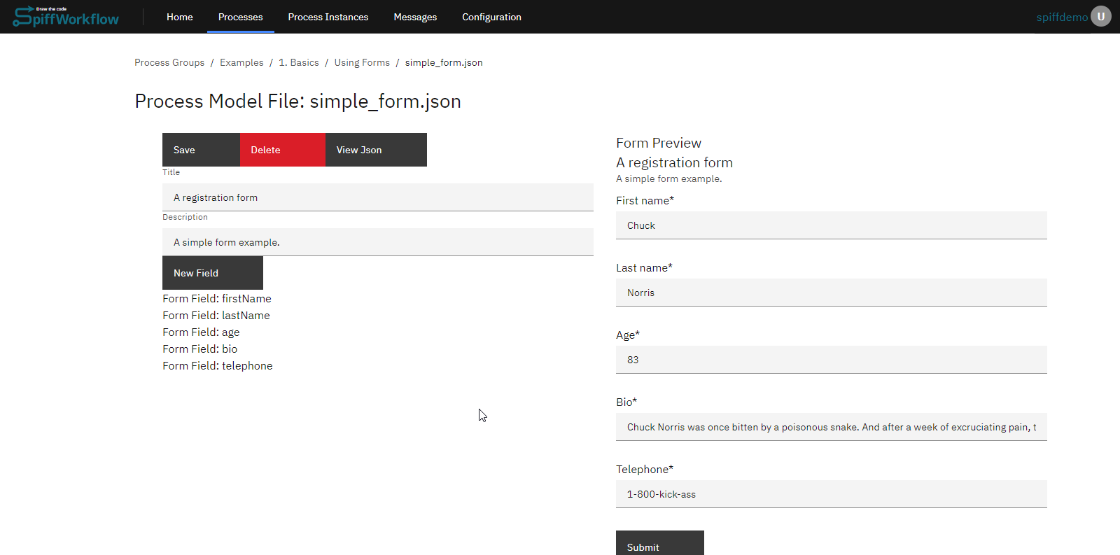
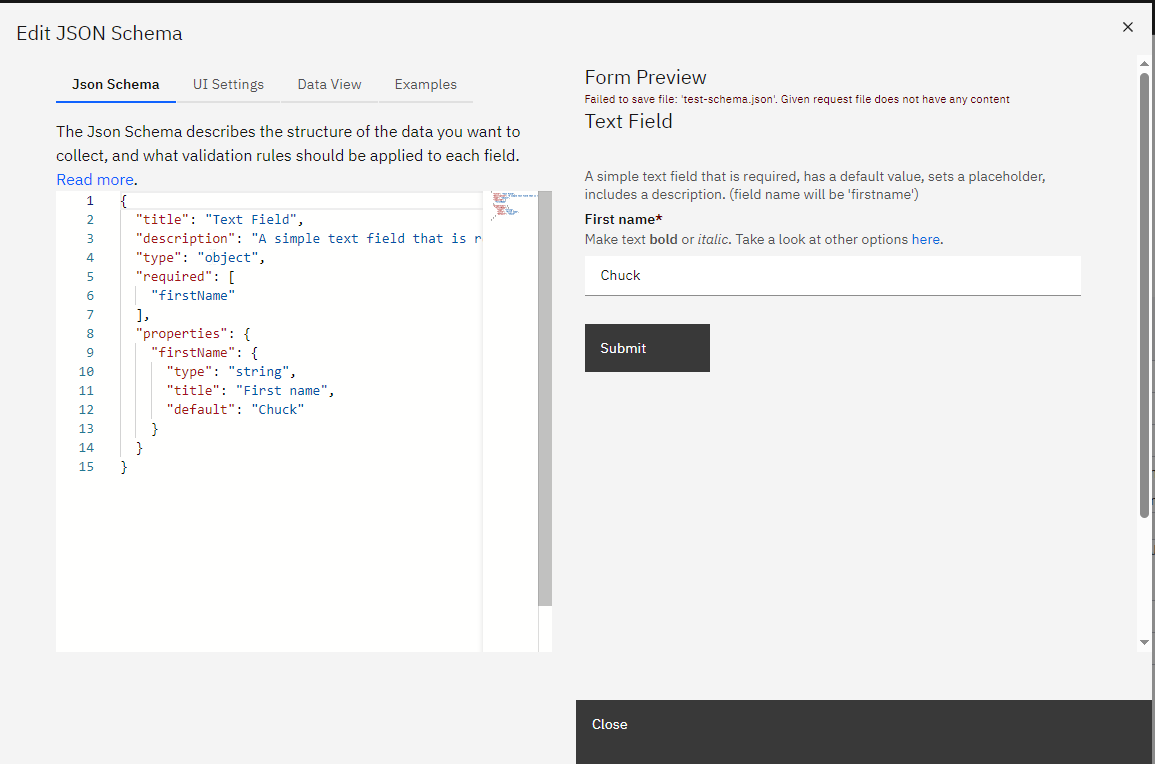
- In the editor, proceed to the "Web form" section. Navigate to the "Web form" section. If starting from scratch, launch the editor and name your file (e.g., "demo"). After saving, it will automatically generate three essential files for us: a schema, UI settings, and some example data.
Understanding the Three Core Files
-
JSON Schema: This file describes the form. It allows you to define titles, property names, and more. As you make changes in this file, they will reflect in the form preview window. This schema outlines the properties or data points you aim to collect.
-
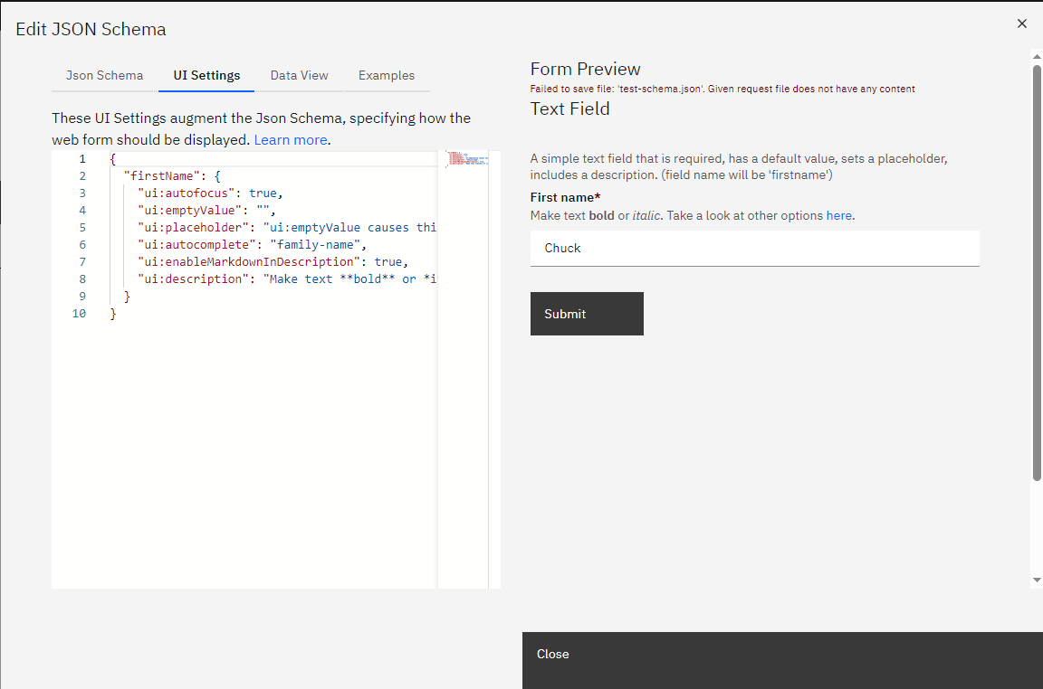
UI Settings: This file offers customization options for your form. You can edit descriptions, titles, and more. Changes made here are reflected in real-time on the form.
-
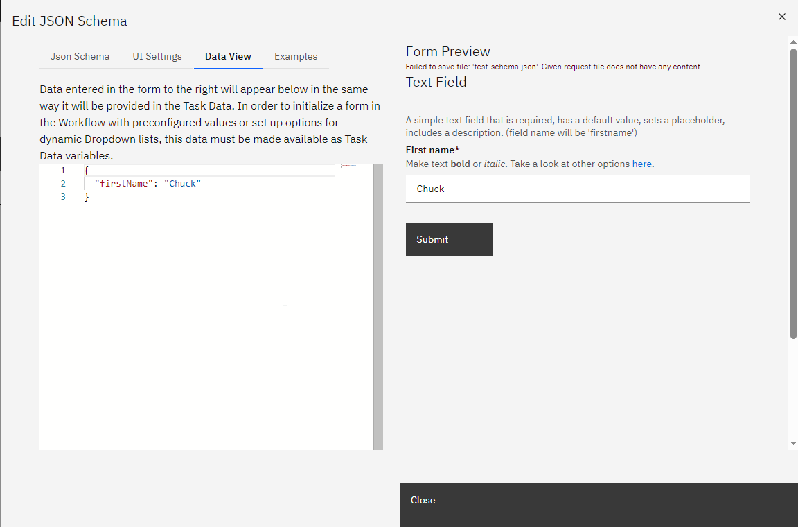
Data View: This section displays the data users input into the form. It provides a preview of what will be captured when the form is submitted. Both the data view and the form stay synchronized, ensuring consistency.
Adding and Customizing Form Elements
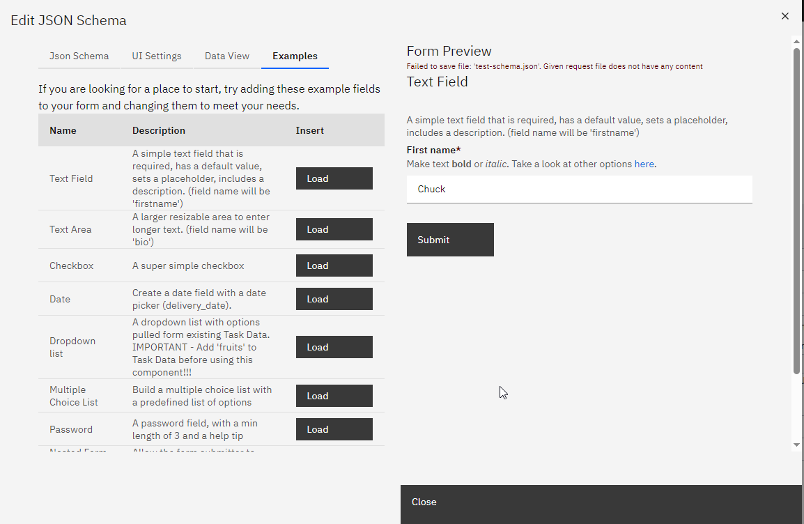
You can add existing templates to add elements to your form, such as text areas, checkboxes, and date selectors. Each element can be further customized in the JSON schema and UI settings. For instance, you can set the UI widget correctly for each element, ensuring it appears as intended on the form.
SpiffArena react-jsonschema-form enhancements
SpiffArena has enhanced the capabilities of react-jsonschema-form to provide users with more dynamic and flexible form-building options.
Dynamic Enumerations
Dynamic enumerations allow you to provide users with a list of options (in a select / dropdown) that can change based on variables in the process instance. This feature is useful when you want to present users with choices based on an external data source or based on something that happened while the process was running. To implement dynamic enumerations, update the list of enumeration values by setting a variable in task data. In a script task, that would look like this:
fruits = [
    {
        "value": "apples",
        "label": "Apples"
    },
    {
        "value": "oranges",
        "label": "Oranges"
    },
    {
        "value": "bananas",
        "label": "Bananas"
    }
]
Instead of using a script task to define the options directly, you could request information from a user using a form, access an API, or query an external database.
Then use json like this (note the options_from_task_data_var:fruits) when defining the form in order to pull information from the variable called fruits that you defined in task data:
{
    "title": "Dropdown list",
    "description": "A dropdown list with options pulled form existing Task Data. IMPORTANT - Add 'fruits' to Task Data before using this component!!!",
    "type": "object",
    "properties": {
        "favoriteFruit": {
            "title": "Select your favorite fruit",
            "type": "string",
            "anyOf": [
                "options_from_task_data_var:fruits"
            ]
        }
    }
}
Serious Checkbox Validation
Checkbox validation ensures that checkboxes, especially required boolean fields, are properly validated.
By default, react-jsonschema-form only triggers validation when a checkbox field is left undefined.
This enhancement allows you to enforce validation for checkboxes with default values of false to support scenarios like "I have read the EULA" checkboxes.
To use checkbox validation, mark your boolean field required.
This will force the value to be true (the checkbox must be checked) before the form can be submitted.
Regex Validation
Regex validation allows you to validate text input fields based on regular expressions. This is useful when you need to ensure that user inputs match a specific pattern or format, such as email addresses or phone numbers.
- In your JSON schema, include a "pattern" property with a regular expression pattern that defines the valid format for the input field.
Date Range Selector
The date range selector allows users to select a range of dates, such as a start and end date, within a form. You will use this feature when building forms that involve specifying date intervals.
Use a date range selector by creating a form field using the following structure:
Example for json schema:
"travel_date_range": {
    "type": "string",
    "title": "Travel Dates",
    "pattern": "\\d{4}-\\d{2}-\\d{2}:::\\d{4}-\\d{2}-\\d{2}",
    "validationErrorMessage": "You must select Travel dates"
},
Example for UI schema:
"travel_date_range":{
    "ui:widget": "date-range",
    "ui:help": "Indicate the travel start and end dates"
},
Date Validation When Compared to Another Date
Date validation when compared to another date allows you to ensure that a date field meets certain criteria concerning another date field. For instance, you can require that a date must be equal to or greater than another date within the form.
-
To implement date validation compared to another date, use the your JSON schema and specify the date field to compare with using the "minimumDate" property with a format like "field:field_name:start_or_end."
-
"start_or_end" can be either "start" or "end". You can choose to use end if the reference field is part of a range.
This is an example where end_date must be after start_date:
"end_date": {
  "type": "string",
  "title": "End date",
  "format": "date",
  "minimumDate": "field:start_date"
}
These enhancements provide you with more flexibility and control when building forms in SpiffArena. By using these features, you can create dynamic, validated forms that enhance the user experience and support your business processes effectively.
Display UI Help in Web Forms
When designing web forms, it's essential to provide users with contextual help to ensure they understand the purpose and requirements of each field. This guidance can be achieved by adding help text to specific form fields.
To add help text to a web form field, use the following format:
"field_name": {
  "ui:help": "Your help text here"
}
The text specified in the "ui:help" attribute will be displayed inside the form when the process starts, providing users with the necessary guidance.
Example:
Consider a form with two fields: form_num_1 and system_generated_number.
Here's how you can add help text to the form_num_1 field and make the system_generated_number field read-only:
{
  "form_num_1": {
    "ui:autofocus": true,
    "ui:help": "Pick whatever # you want!"
  },
  "system_generated_number": {
    "ui:readonly": true
  }
}
In the example above:
- The
form_num_1field will automatically be focused when the form loads (due to the"ui:autofocus": trueattribute). - The help text "Pick whatever # you want!" will be displayed for the
form_num_1field.
Output:
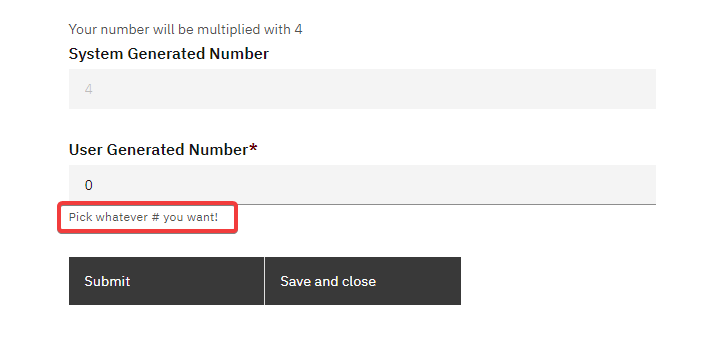
By incorporating such help texts, you can enhance the user experience and ensure that users fill out the form correctly.
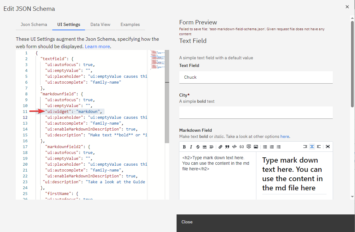
Markdown Widget for rjsf Forms
The Markdown Widget enhances rjsf forms by allowing users to input and preview markdown text directly within the form.
To incorporate the markdown widget into your rjsf form, follow these steps:
-
Create a Text Field: In your rjsf form JSON schema, define a standard text field where you want the markdown content to be entered.
-
Update the uiSchema: For the text field you've created, add the following line to its uiSchema to specify the markdown widget:
"ui:widget": "markdown"