23 KiB
User Tasks and Forms
User Tasks are a key feature in BPMN (Business Process Model and Notation) workflows where human interaction is required to complete a process. In SpiffWorkflow, User Tasks are closely integrated with Forms, which are used to collect input or display information to users during process execution.
Some key features of user tasks are:
- Involve direct interaction with the user.
- Typically linked to a form for data collection or information display.
- Can include custom validation and dynamic content.
- Support task assignment to specific users or groups.
When to Use User Tasks:
- To gather approvals or confirmations from users.
- To collect data required for further process execution.
- To provide users with critical information during a workflow.
Steps to Set Up a User Task
1. Add a User Task in the BPMN Model
- Drag and drop the User Task symbol onto your BPMN diagram.
- Connect it to the previous and subsequent tasks in the process flow.
2. Configuring the User Task Click on the user task in the BPMN editor to display the Properties Panel on the right. Below are the key sections and settings for user tasks:
:alt: Service Task
:width: 300px
:align: right
General
- Name: Provide a meaningful name for the task (e.g., "Name Form").
- ID: Automatically generated or customizable unique identifier for the task.
Documentation
- Add descriptions or notes to document the purpose of the task.
Pre/Post Scripts
- Pre-Script: Add Python scripts to execute before the task starts.
- Post-Script: Add Python scripts to execute after the task is completed.
- Use the "Launch Editor" button to access the code editor.
Web Form (With JSON Schemas)
- JSON Schema Filename: Select or define the form schema to be displayed during task execution.
- Form Description (RJSF): Provide an additional description for the form.
- Use the "Launch Editor" button to edit or view the schema, UI settings, or data.
Instructions
- Add instructions that will appear above the form during task execution to guide the user.
Guest Options
- Guest Can Complete This Task: Allow non-logged-in users (guests) to complete the task. This is useful for workflows requiring external inputs, such as surveys or public forms.
- Guest Confirmation: Add a markdown confirmation message that appears after task submission.
Input/Output Management
- Use the "Inputs" and "Outputs" sections to define specific variables accessible to or from the task. If not defined, all process variables are accessible.
Forms
Forms in SpiffWorkflow enable you to create intuitive user interfaces for collecting data during User Tasks. They are configured using JSON Schema and can be customized with dynamic elements, validations, and UI enhancements.
Let's dive in and explore the possibilities of creating forms in SpiffArena.
Creating Forms
Here are the ways to create forms:
- Using JSON Schema
JSON Schema is a standard for describing the structure of data in a JSON file. JSON Schema forms the foundation for building forms in SpiffArena.
To simplify the form creation process, we use the React JSON Schema Form (RJSF) library. RJSF is a powerful tool that uses JSON Schema as its basis. It enables you to create dynamic and interactive forms with ease. The RJSF library is open source, free to use, and follows the principles of open standards.
Please note that while this guide provides a basic understanding of JSON Schema and RJSF, there is much more to explore. We encourage you to refer to the official RJSF documentation for comprehensive details and advanced techniques.
- Using Form Builder
An alternative approach to creating JSON code is to utilize the form builder feature, which allows you to easily create various fields without the need for writing JSON manually.
However, it's important to note that the form builder may have certain limitations in terms of features and may not be as powerful as using the JSON editor directly.
While the form builder provides convenience and simplicity, using the JSON editor offers greater flexibility and control over the form structure.
- Creating Forms from BPMN Editor
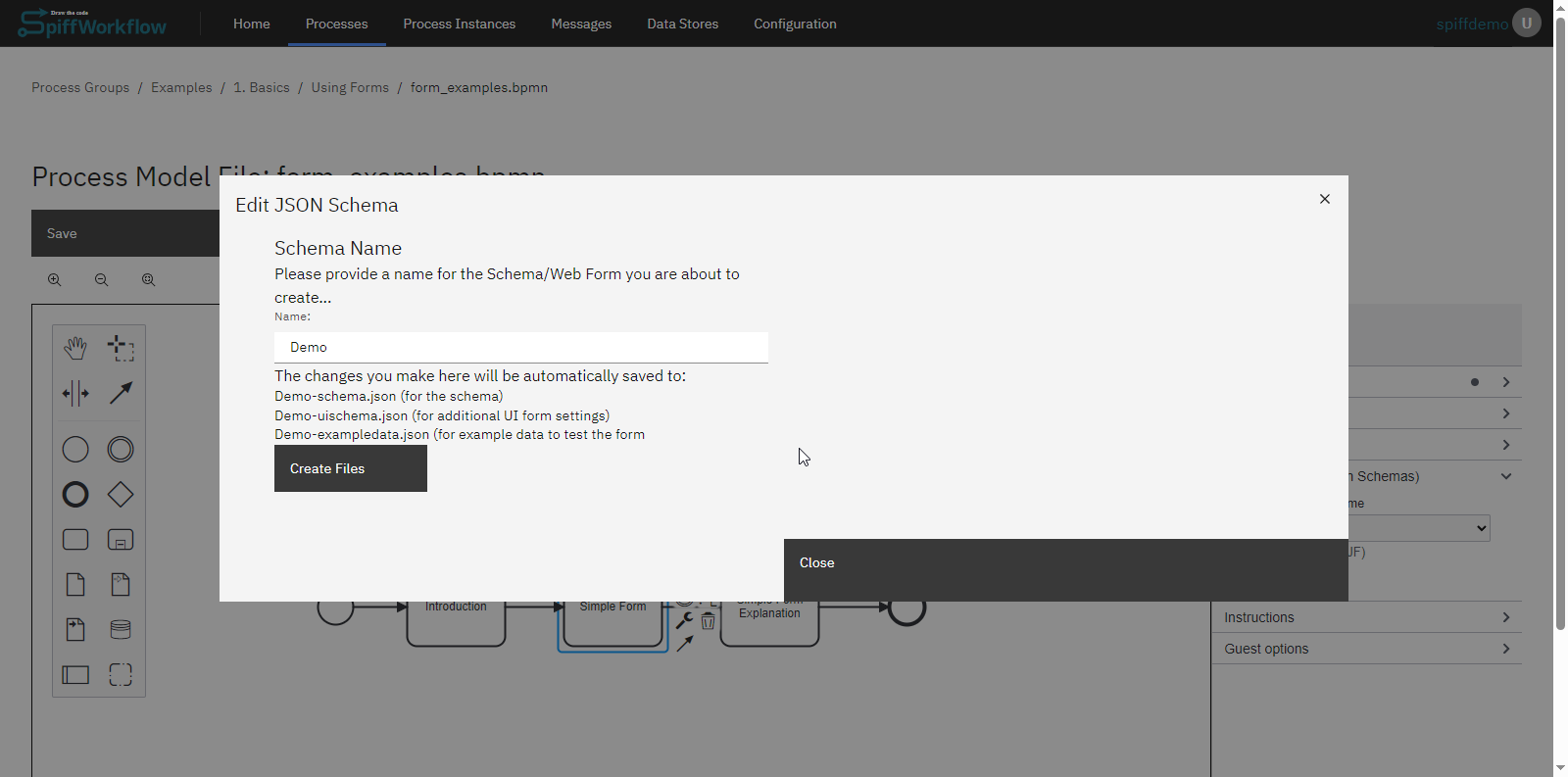
To create forms inside the editor, we utilize user tasks within the BPMN file. Upon creating a new BPMN file, open it to access the editor.
Start the Form Editor
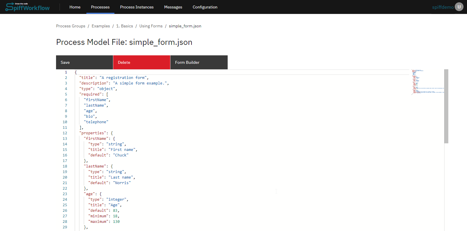
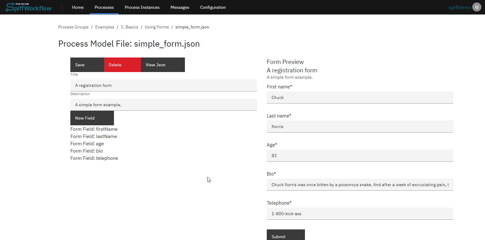
- In the editor, go to the "Web form" section. Navigate to the "Web form" and If starting from scratch, launch the editor and name your file (e.g., "demo"). After saving, it will automatically generate three essential files for us: a schema, UI settings, and some example data.
Understanding the Three Core Files
- JSON Schema: This file describes the form. It allows you to define titles, property names, and more. As you make changes in this file, they will reflect in the form preview window. This schema outlines the properties or data points you aim to collect.
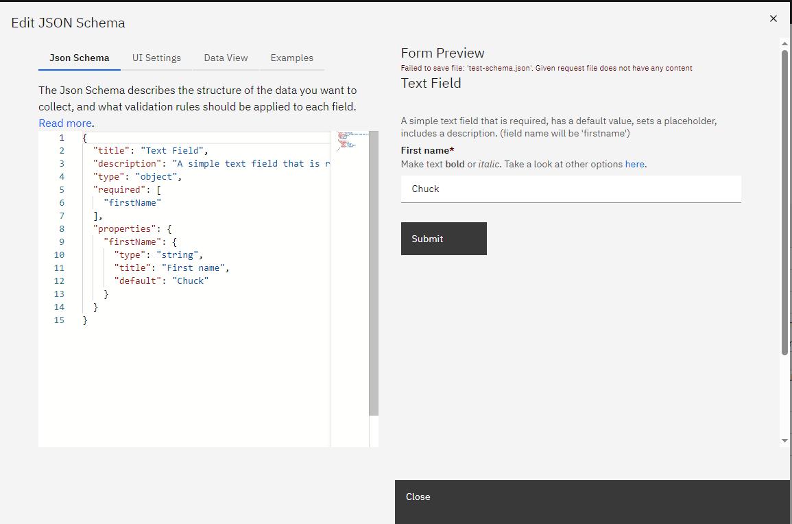
- UI Settings: This file offers customization options for your form. You can edit descriptions, titles, and more. Changes made here are reflected in real-time on the form.
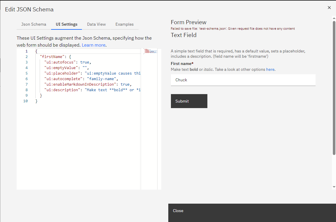
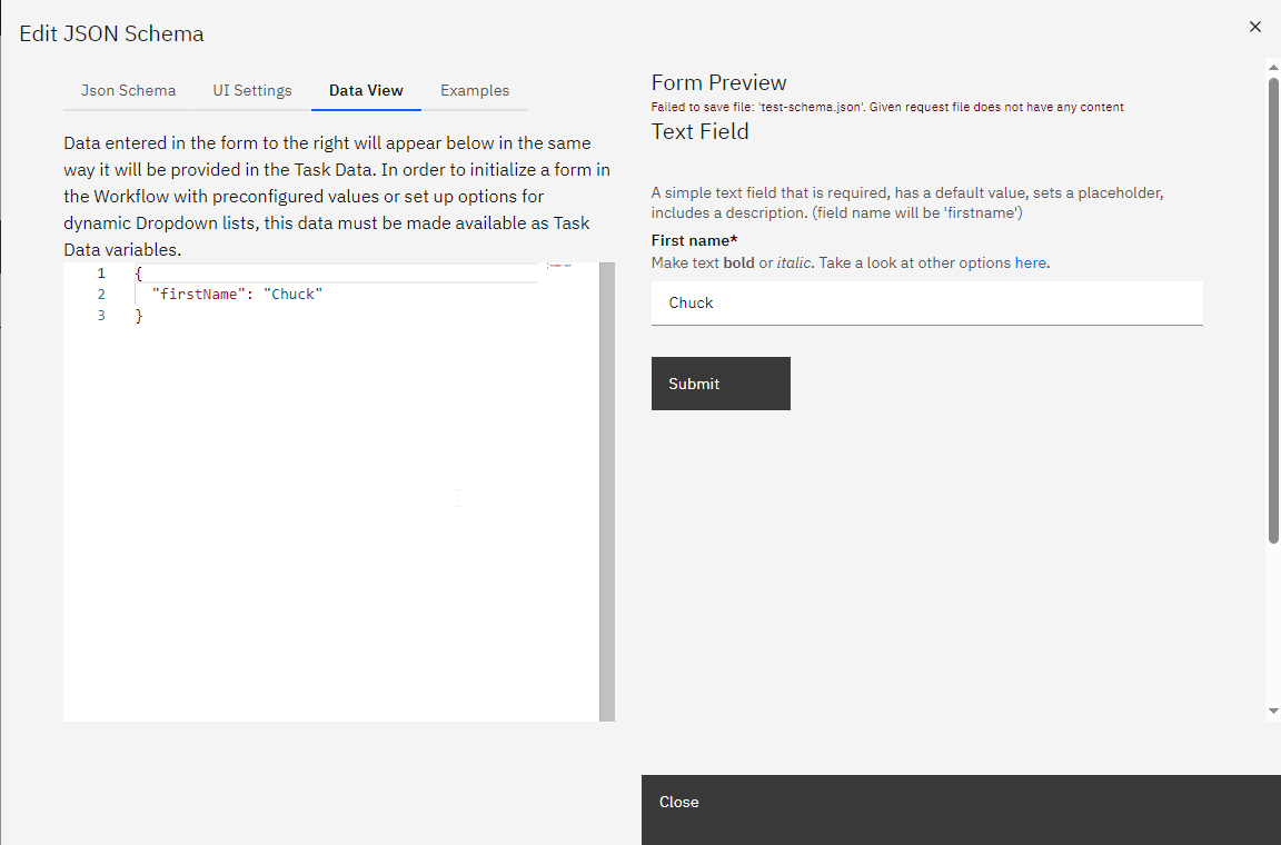
- Data View: This section displays the data users input into the form. It provides a preview of what will be captured when the form is submitted. Both the data view and the form stay synchronized, ensuring consistency.
Adding and Customizing Form Elements
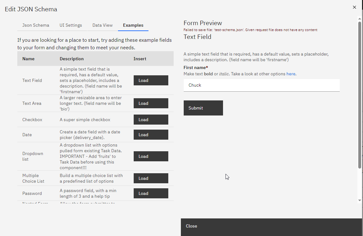
You can add existing templates to add elements to your form, such as text areas, checkboxes, and date selectors. Each element can be further customized in the JSON schema and UI settings. For instance, you can set the UI widget correctly for each element, ensuring it appears as intended on the form.
SpiffArena react-jsonschema-form enhancements
SpiffArena has enhanced the capabilities of react-jsonschema-form to provide users with more dynamic and flexible form-building options.
Dynamic Enumerations
Dynamic enumerations allow you to provide users with a list of options (in a select/dropdown) that can change based on variables in the process instance.
This feature is useful when you want to present users with choices based on an external data source or based on something that happened while the process was running.
To implement dynamic enumerations, update the list of enumeration values by setting a variable in task data. In a script task, that would look like this:
#python
    fruits = [
        {
            "value": "apples",
            "label": "Apples"
        },
        {
            "value": "oranges",
            "label": "Oranges"
        },
        {
            "value": "bananas",
            "label": "Bananas"
        }
    ]
Instead of using a script task to define the options directly, you could request information from a user using a form, access an API, or query an external database.
Then use JSON like this (note the options_from_task_data_var:fruits) when defining the form in order to pull information from the variable called fruits that you defined in task data:
    {
        "title": "Dropdown list",
        "description": "A dropdown list with options pulled from existing Task Data. IMPORTANT - Add 'fruits' to Task Data before using this component!!!",
        "type": "object",
        "properties": {
            "favoriteFruit": {
                "title": "Select your favorite fruit",
                "type": "string",
                "anyOf": [
                    "options_from_task_data_var:fruits"
                ]
            }
        }
    }
Checkbox Validation
Checkbox validation ensures that checkboxes, especially required boolean fields, are properly validated. By default, react-jsonschema-form only triggers validation when a checkbox field is left undefined.
This allows you to enforce validation for checkboxes with default values of false to support scenarios like "I have read the EULA" checkboxes.
To use checkbox validation, mark your boolean field required.
This will force the value to be true (the checkbox must be checked) before the form can be submitted.
When working with both Python and JSON, be aware that `True` and `False` are capitalized in Python but must be lowercase (`true` and `false`) in JSON format.
Regex Validation
Regex validation allows you to validate text input fields based on regular expressions. This is useful when you need to ensure that user inputs match a specific pattern or format, such as email addresses or phone numbers.
In your JSON schema, include a pattern property with a regular expression pattern that defines the valid format for the input field.
Date Range Selector
The date range selector allows users to select a range of dates, such as a start and end date, within a form. You will use this feature when building forms that involve specifying date intervals.
Use a date range selector by creating a form field using the following structure:
Example for JSON schema:
    "travel_date_range": {
        "type": "string",
        "title": "Travel Dates",
        "pattern": "\\d{4}-\\d{2}-\\d{2}:::\\d{4}-\\d{2}-\\d{2}",
        "validationErrorMessage": "You must select Travel dates"
    },
Example for UI schema:
    "travel_date_range":{
        "ui:widget": "date-range",
        "ui:help": "Indicate the travel start and end dates"
    },
Date Validation
Date validation when compared to another date allows you to ensure that a date field meets certain criteria concerning another date field.
Minimum date validation
For instance, you can require that a date must be equal to or greater than another date within the form.
-
To implement date validation compared to another date, use your JSON schema and specify the date field to compare with using the "minimumDate" property with a format like "field:field_name:start_or_end."
-
"start_or_end" can be either "start" or "end". You can choose to use "end" if the reference field is part of a range.
This is an example where the end_date must be after the start_date:
    "end_date": {
      "type": "string",
      "title": "End date",
      "format": "date",
      "minimumDate": "field:start_date"
    }
Maximum date validation
Maximum date validation in relation to another date allows you to set constraints on a date field to ensure that it falls on or before another specified date within the form. This type of validation is particularly useful for setting deadlines, end dates, or the latest possible dates that are contingent on other dates in the workflow.
To apply maximum date validation in your JSON schema, use the maximumDate property and specify the field to compare with, using the format field:field_name.
This ensures that the date chosen does not exceed the referenced field's date.
Here’s an example where delivery_date must be on or before end_date:
"delivery_date": {
  "type": "string",
  "title": "Delivery Date",
  "format": "date",
  "maximumDate": "field:end_date"
}
If the referenced field is a date range, and you want to validate against the end of that range, the same field:end_date reference can be used, as the maximumDate will intuitively apply to the end of the range.
Using maximum date validation, you can prevent dates from exceeding a certain threshold, which is essential for managing project timelines, delivery schedules, or any scenario where the latest permissible date is a factor.
Date Validation Scenario: Enforcing Minimum and Maximum Date Constraints
Scenario Overview
Workflow processes often require the enforcement of minimum and maximum date constraints to align with operational timelines or project deadlines.
This scenario demonstrates the configuration of both minimumDate and maximumDate validations within a form, ensuring that selected dates fall within a specific period defined by other date fields in the workflow.
JSON Schema Configuration:
The "test-maximum-date-schema.json" process model outlines a form structure that includes fields for end_date, delivery_date, and delivery_date_range, each with constraints on the earliest and latest dates that can be selected.
{
  "title": "Date",
  "description": "Test Maximum Date",
  "type": "object",
  "properties": {
    "end_date": {
      "type": "string",
      "format": "date",
      "title": "End Date"
    },
    "delivery_date": {
      "type": "string",
      "title": "Preferred Delivery Date",
      "minimumDate": "today",
      "maximumDate": "field:end_date"
    },
    "delivery_date_range": {
      "type": "string",
      "title": "Preferred Delivery Date Range",
      "minimumDate": "today",
      "maximumDate": "field:end_date"
    }
  }
}
Field Descriptions:
- End Date: The final date by which all activities should be completed.
- Preferred Delivery Date: A single date indicating when the delivery of a service or product is preferred, bounded by today's date and the
end_date. - Preferred Delivery Date Range: A span of dates indicating an acceptable window for delivery, constrained by today's date and the
end_date.
Implementation:
The schema enforces the following rules:
- The
Preferred Delivery Datecannot be earlier than today (theminimumDate) and not later than theend_date(themaximumDate). - The
Preferred Delivery Date Rangemust start no earlier than today and end no later than theend_date.
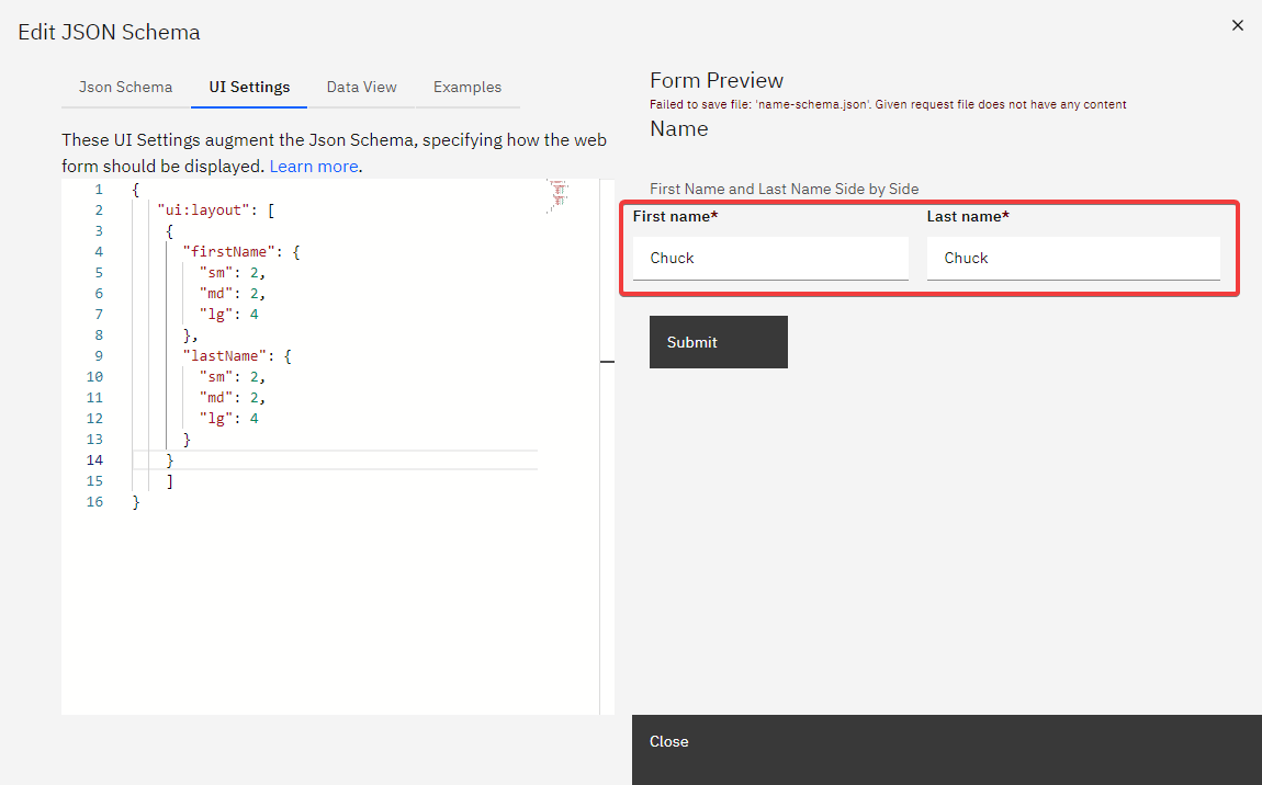
Display Fields Side-By-Side on Same Row
When designing forms, it's often more user-friendly to display related fields, such as First Name and Last Name, side by side on the same row, rather than stacked vertically.
The ui:layout attribute in your form's JSON schema enables this by allowing you to specify how fields are displayed relative to each other, controlling the grid columns each field occupies for a responsive design.
Form Schema Example:
Define your form fields in the JSON schema as follows:
{
  "title": "Side by Side Layout",
  "description": "Demonstrating side-by-side layout",
  "type": "object",
  "properties": {
    "firstName": { "type": "string" },
    "lastName": { "type": "string" },
    "notes": { "type": "string" }
  }
}
ui:layout Configuration:
The ui:layout attribute accepts an array of objects, each representing a conceptual "row" of fields.
Here's how to use it:
{
  "ui:layout": [
    {
      "firstName": { "sm": 2, "md": 2, "lg": 4 },
      "lastName": { "sm": 2, "md": 2, "lg": 4 }
    },
    { "notes": {} }
  ]
}
Key Points:
- Layout Design: The
ui:layoutspecifies thatfirstNameandlastNameshould appear side by side. Each field's size adjusts according to the screen size (small, medium, large), utilizing grid columns for responsive design. - Responsive Columns: Values (
sm,md,lg) indicate the number of grid columns a field should occupy, ensuring the form remains functional and visually appealing across devices. - Simplified Configuration: If column widths are unspecified, the layout will automatically adjust, providing flexibility in design.
Example Illustrated:
In this setup, we’re arranging firstName and lastName to appear in the same row, as they are grouped in the first element of the ui:layout array.
We specify that firstName should occupy 4 columns on large displays, with lastName also taking up 4 columns, together filling the full row of 8 columns on large screens. For medium screens, the layout adapts to 5 columns, and for small screens, it adjusts to 4 columns.
By defining a uiSchema like this, the layout will automatically adjust the column widths for each screen size.
    {
      "ui:layout": [
        {
          "firstName": {},
          "lastName": {}
        }
      ]
    }
By using the ui:layout feature, you can design form layouts that are not only functional but also enhance the user experience, making your forms well-organized and accessible across various screen sizes.
Display UI Help in Web Forms
When designing web forms, it's important to provide users with contextual help to ensure they understand the purpose and requirements of each field. This guidance can be achieved by adding help text to specific form fields.
To add help text to a web form field, use the following format:
"field_name": {
  "ui:help": "Your help text here"
}
The text specified in the "ui:help" attribute will be displayed inside the form when the process starts, providing users with the necessary guidance.
Example:
Consider a form with two fields: form_num_1 and system_generated_number.
Here's how you can add help text to the form_num_1 field and make the system_generated_number field read-only:
{
  "form_num_1": {
    "ui:autofocus": true,
    "ui:help": "Pick whatever # you want!"
  },
  "system_generated_number": {
    "ui:readonly": true
  }
}
In the example above:
- The
form_num_1field will automatically be focused when the form loads (due to the"ui:autofocus": trueattribute). - The help text "Pick whatever # you want!" will be displayed for the
form_num_1field.
Output:
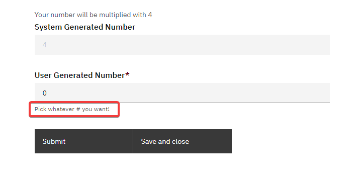
By incorporating such help texts, you can enhance the user experience and ensure that users fill out the form correctly.
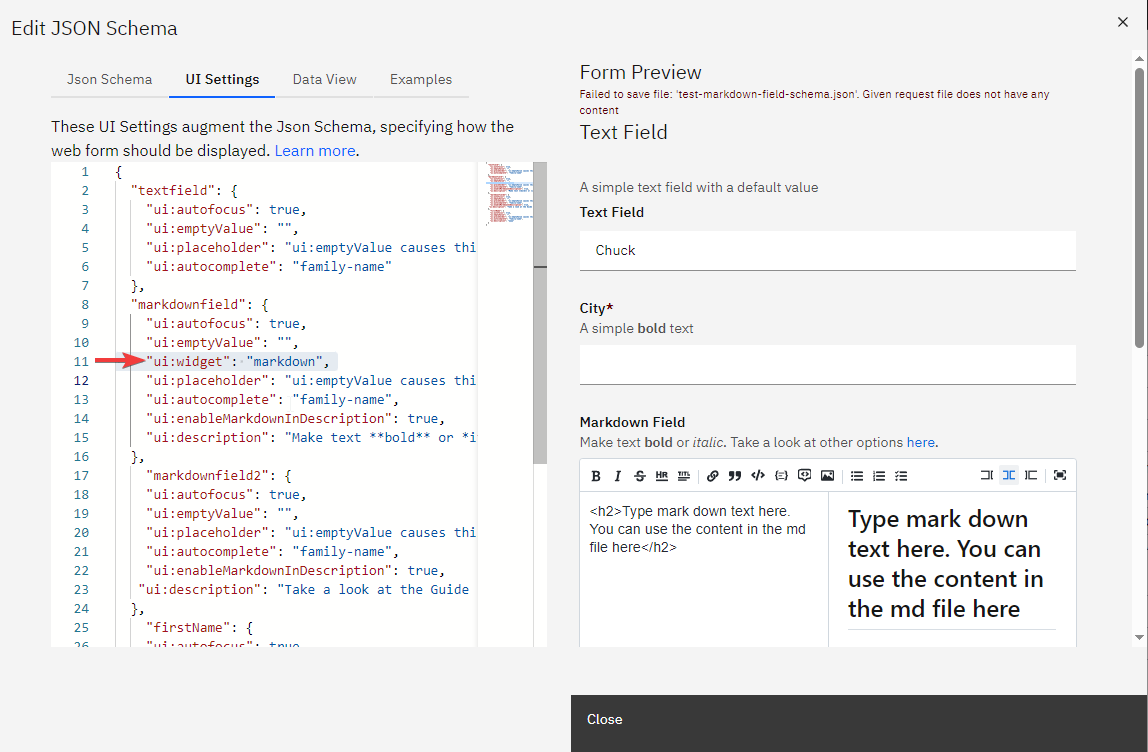
Markdown Widget for rjsf Forms
The Markdown Widget enhances rjsf forms by allowing users to input and preview markdown text directly within the form.
To incorporate the markdown widget into your rjsf form, follow these steps:
-
Create a Text Field: In your rjsf form JSON schema, define a standard text field where you want the markdown content to be entered.
-
Update the uiSchema: For the text field you've created, add the following line to its uiSchema to specify the markdown widget:
"ui:widget": "markdown"
Numeric Range Field
Overview
The NumericRangeField component is a new feature in spiffworkflow-frontend that allows users to input numeric ranges.
This component is designed to work with JSON schemas and provides two text inputs for users to enter minimum and maximum values for a given numeric range.
JSON Schema Example
Below is an example JSON schema that includes the numeric range field:
{
  "title": "Example Schema",
  "type": "object",
  "properties": {
    "numericRange": {
      "type": "object",
      "title": "Numeric Range",
      "minimum": {
        "type": "number",
        "title": "Minimum Value"
      },
      "maximum": {
        "type": "number",
        "title": "Maximum Value"
      }
    }
  }
}
This schema defines a numeric range object with min and max properties, both of which are required.
UI Schema Example
{
  "numericRange": {
    "ui:field": "numeric-range"
  }
}
Validation
This will automatically validate that the max value cannot be less than the min value.
Adding a New Button for Repeating Sections in Forms
Nested forms or repeating sections are designed to collect an array of objects, where each object represents a set of related information. For instance, in a task management form, you might need to collect multiple tasks, each with its title and completion status.
This structure can be represented in the form's schema as follows:
{
  "title": "Nested Form / Repeating Section",
  "description": "Allow the form submitter to add multiple entries for a set of fields.",
  "type": "object",
  "properties": {
    "tasks": {
      "type": "array",
      "title": "Tasks",
      "items": {
        "type": "object",
        "required": ["title"],
        "properties": {
          "title": {
            "type": "string",
            "title": "Title",
            "description": "Please describe the task to complete"
          },
          "done": {
            "type": "boolean",
            "title": "Done?",
            "default": false
          }
        }
      }
    }
  }
}
Form Preview:
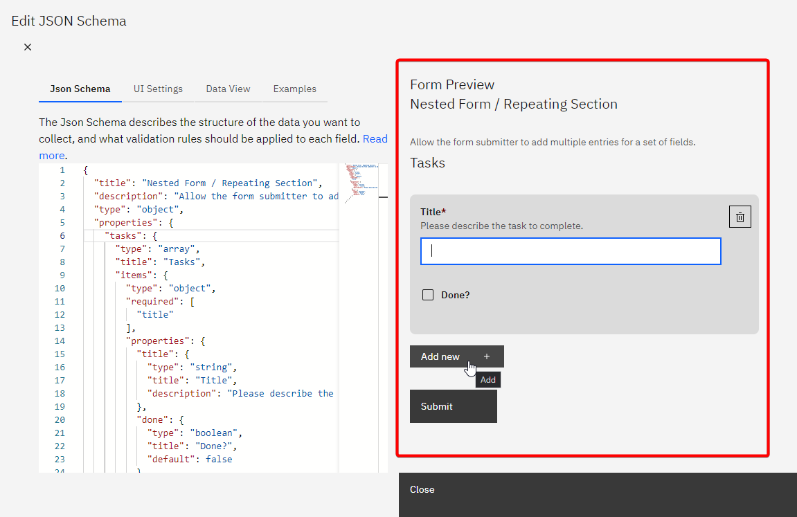
By using this feature, you can effectively implement new buttons for nested forms or repeating sections, improving the form's usability for collecting multiple related entries from users.
Character counter
To give the user feedback about how they are doing in terms of staying within the limits imposed by the field, you can display a character counter.
JSON Schema Configuration
To do this, your JSON schema must contain a string with a maxLength, like this:
{
  "title": "String with character counter",
  "type": "object",
  "properties": {
    "my_hot_string": {
      "type": "string",
      "maxLength": 100
    }
  }
}
UI Schema Configuration
Your UI Schema will need a ui:options specifying counter: true, like this:
{
  "my_hot_string": {
    "ui:options": {
      "counter": true
    }
  }
}
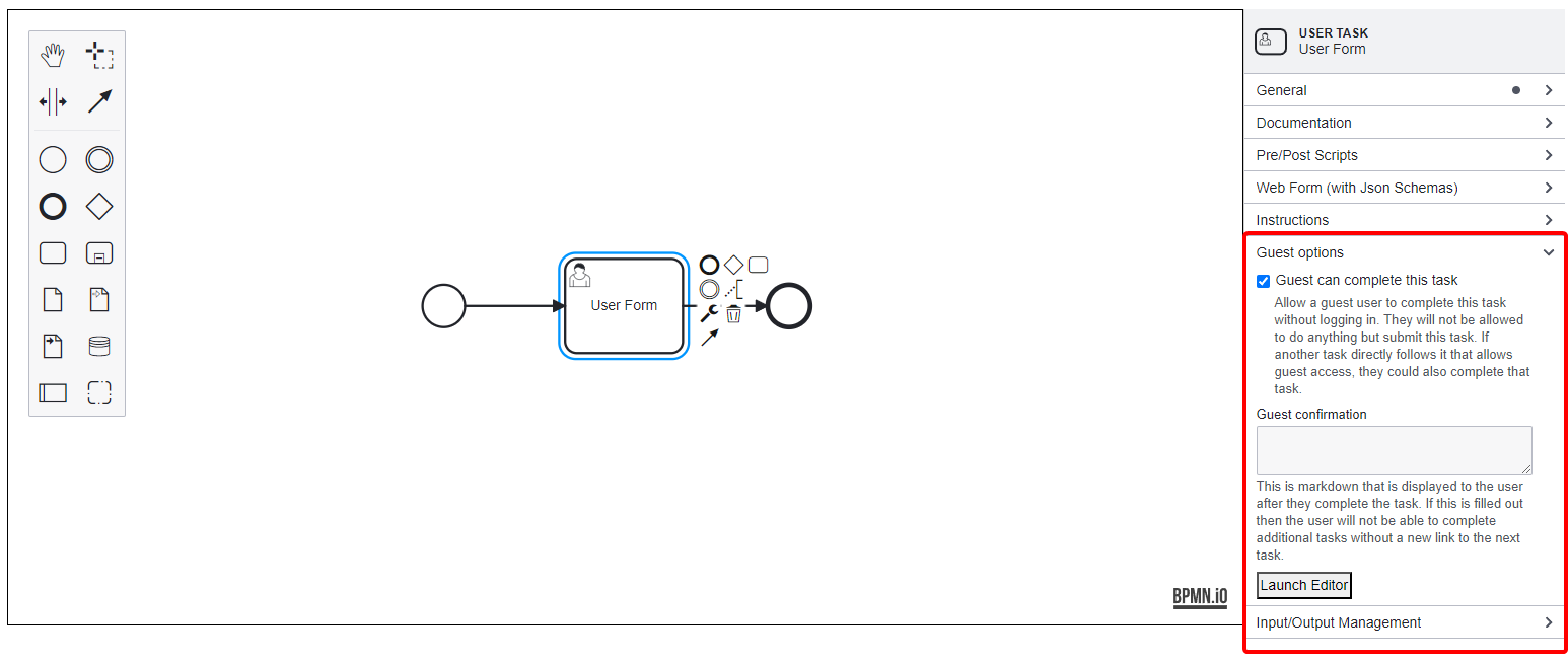
Guest User Task
The Guest User Task feature in SpiffArena allows users who are not logged into the system to complete specified human tasks. This functionality enhances accessibility and usability, enabling a broader range of users to interact with the process models without requiring an account.
Key Features
- Task Accessibility: Allows guest users to complete tasks marked as "allow guest" in the process model.
- Direct Navigation: Guests can access tasks via a constructed URL, eliminating the need for login credentials.
- Security Measures: Guests are redirected to the login screen if they attempt to navigate away from the task page, ensuring secure access control.
Testing Instructions
To verify the functionality of the Guest User Task feature, follow these steps:
- Create a Process Model:
Design a process model that includes a manual or user task. Ensure you check the "allow guest" checkbox.
- Start the Process Model:
Initiate the process model using the same user account that created it.
- Access the Task GUID:
Navigate to the process instance show page and retrieve the GUID of the human task.
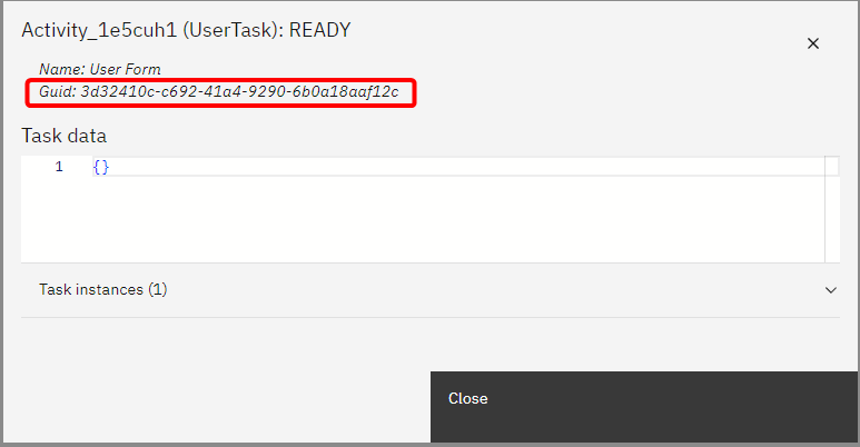
- Construct the Access URL:
Create a URL in this format:
[domain]/public/tasks/[process_instance_id]/[task_guid]
Replace [domain], [process_instance_id], and [task_guid] with appropriate values.
- Test as a Guest User:
Open an incognito or private browsing window (not logged into Spiff). Navigate to the constructed URL. Confirm that the guest user can complete the task.
The Guest User Task feature improves usability for non-logged-in users by allowing them to complete designated tasks seamlessly.