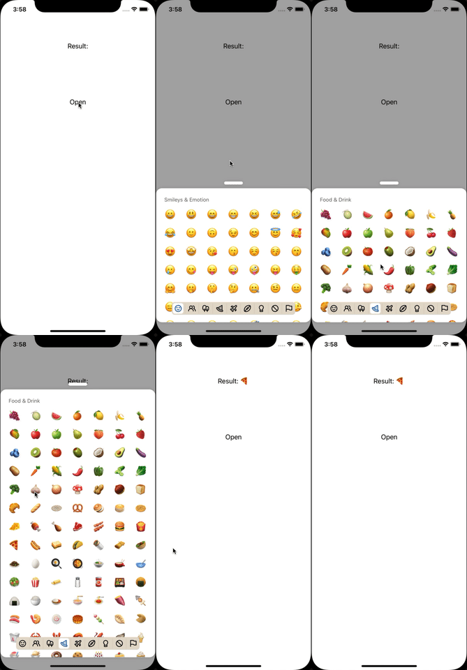
🚀 rn-emoji-keyboard
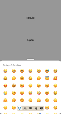
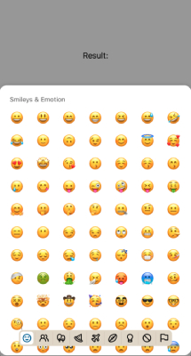
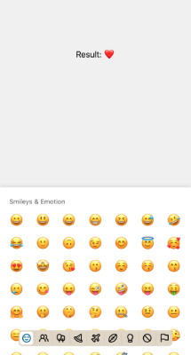
A lightweight, fully customizable emoji picker, written as React Native component (without native elements). Designated to be user and developer friendly! 💖
🪄 Installation
yarn add rn-emoji-keyboard
or
npm install rn-emoji-keyboard
⚡️ Usage
import EmojiPicker from 'rn-emoji-keyboard';

export default function App() {
  const [isOpen, setIsOpen] = React.useState<boolean>(false);

  const handlePick = (emojiObject: EmojiType) => {
    console.log(emojiObject);
    /* example emojiObject = {
        "emoji": "❤️",
        "name": "red heart",
        "slug": "red_heart",
        "unicode_version": "0.6",
      }
    */
  };

  return (
    <EmojiPicker
      onEmojiSelected={handlePick}
      open={isOpen}
      onClose={() => setIsOpen(false)} />
  )
}
⚙️ Accepted props (current implemented)
| Name | Type | Default Value | Required | Description |
|---|---|---|---|---|
| onEmojiSelected | function | undefined | yes | Callback on emoji selected |
| open | boolean | false | yes | Opens modal picker |
| onClose | function | undefined | yes | Request close modal runs when onEmojiSelected or backdrop pressed |
| emojiSize | number | 28 | no | Custom emoji size |
| headerStyles | TextStyle | {} | no | Override category name styles |
| knobStyles | ViewStyle | {} | no | Override knob styles |
| containerStyles | ViewStyle | {} | no | Override container styles |
| hideHeader | boolean | false | no | Hide category names |
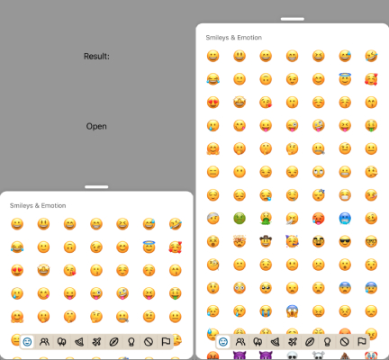
| expandable | boolean | true | no | Show knob and enable expand on swipe up |
| defaultHeight | number | string | "40%" | no | Specify collapsed container height (number is points, string is a percentage of the screen height) |
| expandedHeight | number | string | "80%" | no | Specify expanded container height (number is points, string is a percentage of the screen height) works only if expandable is true |
| backdropColor | string | "#00000055" | no | Change backdrop color and alpha |
| categoryColor | string | "#000000" | no | Change category item color |
| activeCategoryColor | string | "#005b96" | no | Change active category item color |
| categoryContainerColor | string | "#e3dbcd" | no | Change category container color |
| activeCategoryContainerColor | string | "#ffffff" | no | Change selected category container color |
| onCategoryChangeFailed | function | warn(info) | no | Callback on category change failed (info: {index, highestMeasuredFrameIndex, averageItemLength}) |
| translation | CategoryTranslation | en | no | Translation object see translation section |
| disabledCategory | CategoryTypes[] | [] | no | Hide categories by passing their slugs |
🖼 Usage as static
import { EmojiKeyboard } from 'rn-emoji-keyboard';

// ...

<EmojiKeyboard onEmojiSelected={handlePick} />
Example about serving as static keyboard you can find here.
🇺🇸 Internationalization
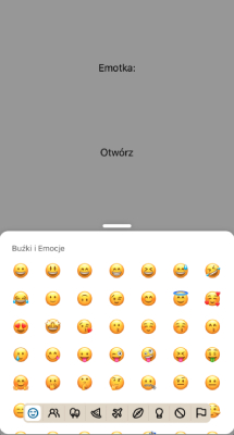
Pre-defined
Due to the limited translation possibilities, we only provide a few pre-defined translations into the following languages:
en- English 🇺🇸pl- Polish 🇵🇱
First import lang and use it as translation prop.
import { pl } from 'rn-emoji-keyboard';

// ...

translation={pl}
🏁 Own
There is possibility to pass own translation to library with the prop called translation like this
translation={{
  smileys_emotion: 'Smileys & Emotion',
  people_body: 'People & Body',
  animals_nature: 'Animals & Nature',
  food_drink: 'Food & Drink',
  travel_places: 'Travel & Places',
  activities: 'Activities',
  objects: 'Objects',
  symbols: 'Symbols',
  flags: 'Flags',
}}
If you have written a translation into your language, we strongly encourage you to create a Pull Request and add your language to the package, following the example of other langs.
🎉 Examples
You can clone the repo and run yarn example ios or yarn example android to preview app with this examples.
Basic
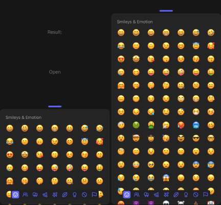
Dark
Translated
DisabledCategories
StaticModal (without knob)
Static
📈 Future plans
- Skin tone palette selector.
- Search bar.
- Write native module to display forbidden emojis on android.
