mirror of
https://github.com/status-im/react-native.git
synced 2025-02-23 06:38:13 +00:00
 4dea677b4f
Summary: Reorganized some of the switch examples to be more testable: Before: 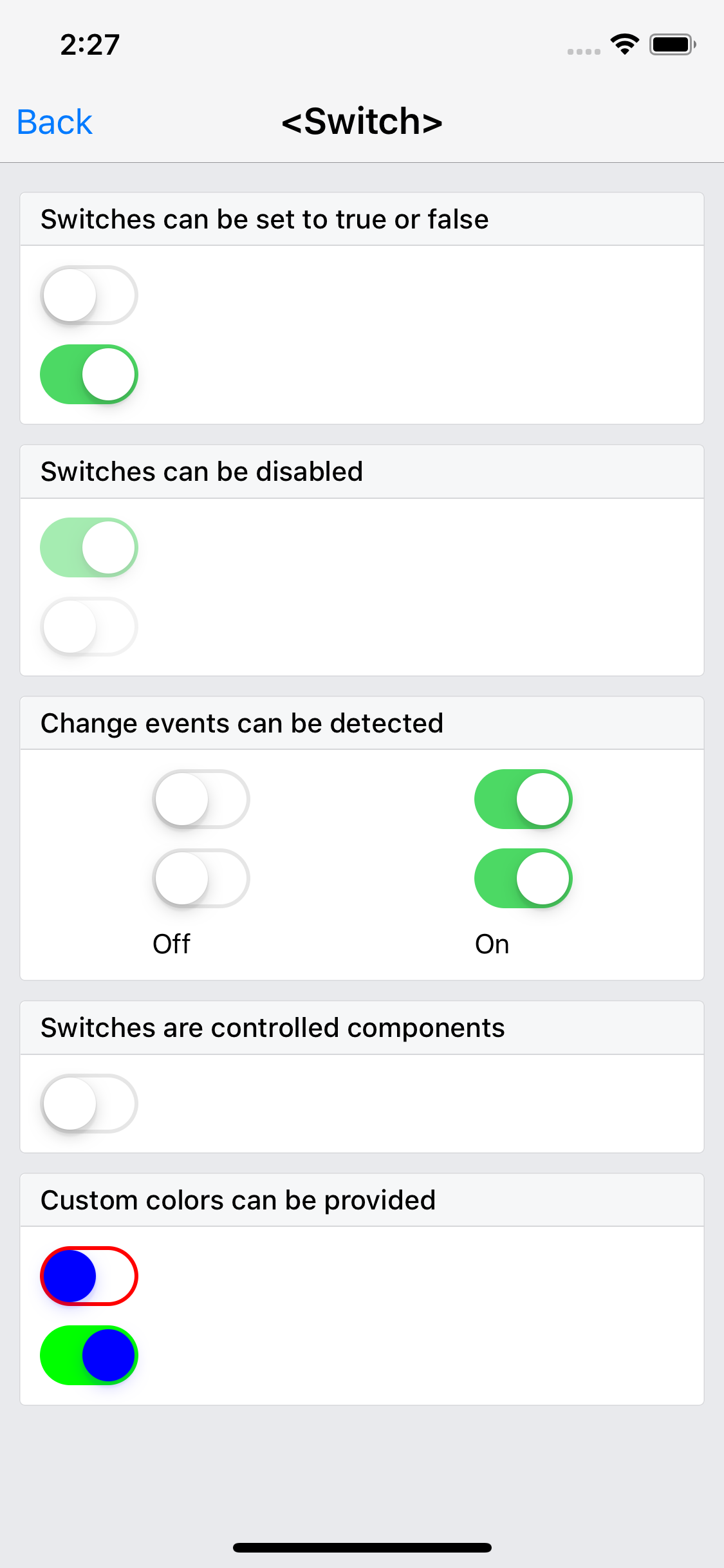 After: 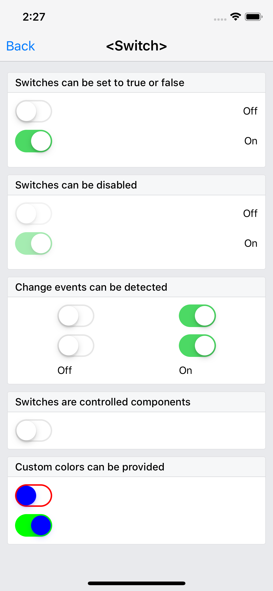 Tests pass! ``` yarn build-ios-e2e && yarn test-ios-e2e ``` <img width="711" alt="screen shot 2018-12-01 at 2 20 33 am" src="https://user-images.githubusercontent.com/249164/49327070-c64cbd80-f510-11e8-8cad-84c3fe42941e.png"> Changelog: ---------- Help reviewers and the release process by writing your own changelog entry. When the change doesn't impact React Native developers, it may be ommitted from the changelog for brevity. See below for an example. [Internal] [Added] - Detox tests for Switch Pull Request resolved: https://github.com/facebook/react-native/pull/22470 Reviewed By: RSNara Differential Revision: D13290329 Pulled By: TheSavior fbshipit-source-id: 91c1b895dd5e1acc4330618e6d3165c7f9215997
238 lines
5.8 KiB
JavaScript
238 lines
5.8 KiB
JavaScript
/**
|
|
* Copyright (c) Facebook, Inc. and its affiliates.
|
|
*
|
|
* This source code is licensed under the MIT license found in the
|
|
* LICENSE file in the root directory of this source tree.
|
|
*
|
|
* @format
|
|
* @flow
|
|
*/
|
|
|
|
'use strict';
|
|
|
|
const React = require('react');
|
|
const {Switch, Text, View} = require('react-native');
|
|
|
|
type OnOffIndicatorProps = $ReadOnly<{|on: boolean, testID: string|}>;
|
|
function OnOffIndicator({on, testID}: OnOffIndicatorProps) {
|
|
return <Text testID={testID}>{on ? 'On' : 'Off'}</Text>;
|
|
}
|
|
|
|
type ExampleRowProps = $ReadOnly<{|children: React.Node|}>;
|
|
function ExampleRow({children}: ExampleRowProps) {
|
|
return (
|
|
<View
|
|
style={{
|
|
flexDirection: 'row',
|
|
justifyContent: 'space-between',
|
|
alignItems: 'center',
|
|
marginBottom: 10,
|
|
}}>
|
|
{children}
|
|
</View>
|
|
);
|
|
}
|
|
|
|
type SimpleSwitchExampleState = $ReadOnly<{|
|
|
trueSwitchIsOn: boolean,
|
|
falseSwitchIsOn: boolean,
|
|
|}>;
|
|
|
|
class BasicSwitchExample extends React.Component<
|
|
{||},
|
|
SimpleSwitchExampleState,
|
|
> {
|
|
state = {
|
|
trueSwitchIsOn: true,
|
|
falseSwitchIsOn: false,
|
|
};
|
|
|
|
render() {
|
|
return (
|
|
<View>
|
|
<ExampleRow>
|
|
<Switch
|
|
testID="on-off-initial-off"
|
|
onValueChange={value => this.setState({falseSwitchIsOn: value})}
|
|
value={this.state.falseSwitchIsOn}
|
|
/>
|
|
<OnOffIndicator
|
|
on={this.state.falseSwitchIsOn}
|
|
testID="on-off-initial-off-indicator"
|
|
/>
|
|
</ExampleRow>
|
|
<ExampleRow>
|
|
<Switch
|
|
testID="on-off-initial-on"
|
|
onValueChange={value => this.setState({trueSwitchIsOn: value})}
|
|
value={this.state.trueSwitchIsOn}
|
|
/>
|
|
<OnOffIndicator
|
|
on={this.state.trueSwitchIsOn}
|
|
testID="on-off-initial-on-indicator"
|
|
/>
|
|
</ExampleRow>
|
|
</View>
|
|
);
|
|
}
|
|
}
|
|
|
|
class DisabledSwitchExample extends React.Component<
|
|
{||},
|
|
SimpleSwitchExampleState,
|
|
> {
|
|
state = {
|
|
trueSwitchIsOn: true,
|
|
falseSwitchIsOn: false,
|
|
};
|
|
|
|
render() {
|
|
return (
|
|
<View>
|
|
<ExampleRow>
|
|
<Switch
|
|
testID="disabled-initial-off"
|
|
disabled={true}
|
|
onValueChange={value => this.setState({falseSwitchIsOn: value})}
|
|
value={this.state.falseSwitchIsOn}
|
|
/>
|
|
|
|
<OnOffIndicator
|
|
on={this.state.falseSwitchIsOn}
|
|
testID="disabled-initial-off-indicator"
|
|
/>
|
|
</ExampleRow>
|
|
|
|
<ExampleRow>
|
|
<Switch
|
|
testID="disabled-initial-on"
|
|
disabled={true}
|
|
onValueChange={value => this.setState({trueSwitchIsOn: value})}
|
|
value={this.state.trueSwitchIsOn}
|
|
/>
|
|
|
|
<OnOffIndicator
|
|
on={this.state.trueSwitchIsOn}
|
|
testID="disabled-initial-on-indicator"
|
|
/>
|
|
</ExampleRow>
|
|
</View>
|
|
);
|
|
}
|
|
}
|
|
|
|
class ColorSwitchExample extends React.Component<{}, $FlowFixMeState> {
|
|
state = {
|
|
colorTrueSwitchIsOn: true,
|
|
colorFalseSwitchIsOn: false,
|
|
};
|
|
|
|
render() {
|
|
return (
|
|
<View>
|
|
<Switch
|
|
onValueChange={value => this.setState({colorFalseSwitchIsOn: value})}
|
|
style={{marginBottom: 10}}
|
|
thumbColor="#0000ff"
|
|
trackColor={{
|
|
false: '#ff0000',
|
|
true: '#00ff00',
|
|
}}
|
|
value={this.state.colorFalseSwitchIsOn}
|
|
/>
|
|
<Switch
|
|
onValueChange={value => this.setState({colorTrueSwitchIsOn: value})}
|
|
thumbColor="#0000ff"
|
|
trackColor={{
|
|
false: '#ff0000',
|
|
true: '#00ff00',
|
|
}}
|
|
value={this.state.colorTrueSwitchIsOn}
|
|
/>
|
|
</View>
|
|
);
|
|
}
|
|
}
|
|
|
|
class EventSwitchExample extends React.Component<{}, $FlowFixMeState> {
|
|
state = {
|
|
eventSwitchIsOn: false,
|
|
eventSwitchRegressionIsOn: true,
|
|
};
|
|
|
|
render() {
|
|
return (
|
|
<View style={{flexDirection: 'row', justifyContent: 'space-around'}}>
|
|
<View>
|
|
<Switch
|
|
onValueChange={value => this.setState({eventSwitchIsOn: value})}
|
|
style={{marginBottom: 10}}
|
|
value={this.state.eventSwitchIsOn}
|
|
/>
|
|
<Switch
|
|
onValueChange={value => this.setState({eventSwitchIsOn: value})}
|
|
style={{marginBottom: 10}}
|
|
value={this.state.eventSwitchIsOn}
|
|
/>
|
|
<Text>{this.state.eventSwitchIsOn ? 'On' : 'Off'}</Text>
|
|
</View>
|
|
<View>
|
|
<Switch
|
|
onValueChange={value =>
|
|
this.setState({eventSwitchRegressionIsOn: value})
|
|
}
|
|
style={{marginBottom: 10}}
|
|
value={this.state.eventSwitchRegressionIsOn}
|
|
/>
|
|
<Switch
|
|
onValueChange={value =>
|
|
this.setState({eventSwitchRegressionIsOn: value})
|
|
}
|
|
style={{marginBottom: 10}}
|
|
value={this.state.eventSwitchRegressionIsOn}
|
|
/>
|
|
<Text>{this.state.eventSwitchRegressionIsOn ? 'On' : 'Off'}</Text>
|
|
</View>
|
|
</View>
|
|
);
|
|
}
|
|
}
|
|
|
|
const examples = [
|
|
{
|
|
title: 'Switches can be set to true or false',
|
|
render(): React.Element<any> {
|
|
return <BasicSwitchExample />;
|
|
},
|
|
},
|
|
{
|
|
title: 'Switches can be disabled',
|
|
render(): React.Element<any> {
|
|
return <DisabledSwitchExample />;
|
|
},
|
|
},
|
|
{
|
|
title: 'Change events can be detected',
|
|
render(): React.Element<any> {
|
|
return <EventSwitchExample />;
|
|
},
|
|
},
|
|
{
|
|
title: 'Switches are controlled components',
|
|
render(): React.Element<any> {
|
|
return <Switch />;
|
|
},
|
|
},
|
|
{
|
|
title: 'Custom colors can be provided',
|
|
render(): React.Element<any> {
|
|
return <ColorSwitchExample />;
|
|
},
|
|
},
|
|
];
|
|
|
|
exports.title = '<Switch>';
|
|
exports.displayName = 'SwitchExample';
|
|
exports.description = 'Native boolean input';
|
|
exports.examples = examples;
|